The concept of the new brand was to present the company as a young, dynamic enterprise corresponding to technological innovation.
Speed throughout – that is the motto that defined associative array. In the name we have proposed to use two bases: Fruit and Jet. Get a short and rapid word Frujet.
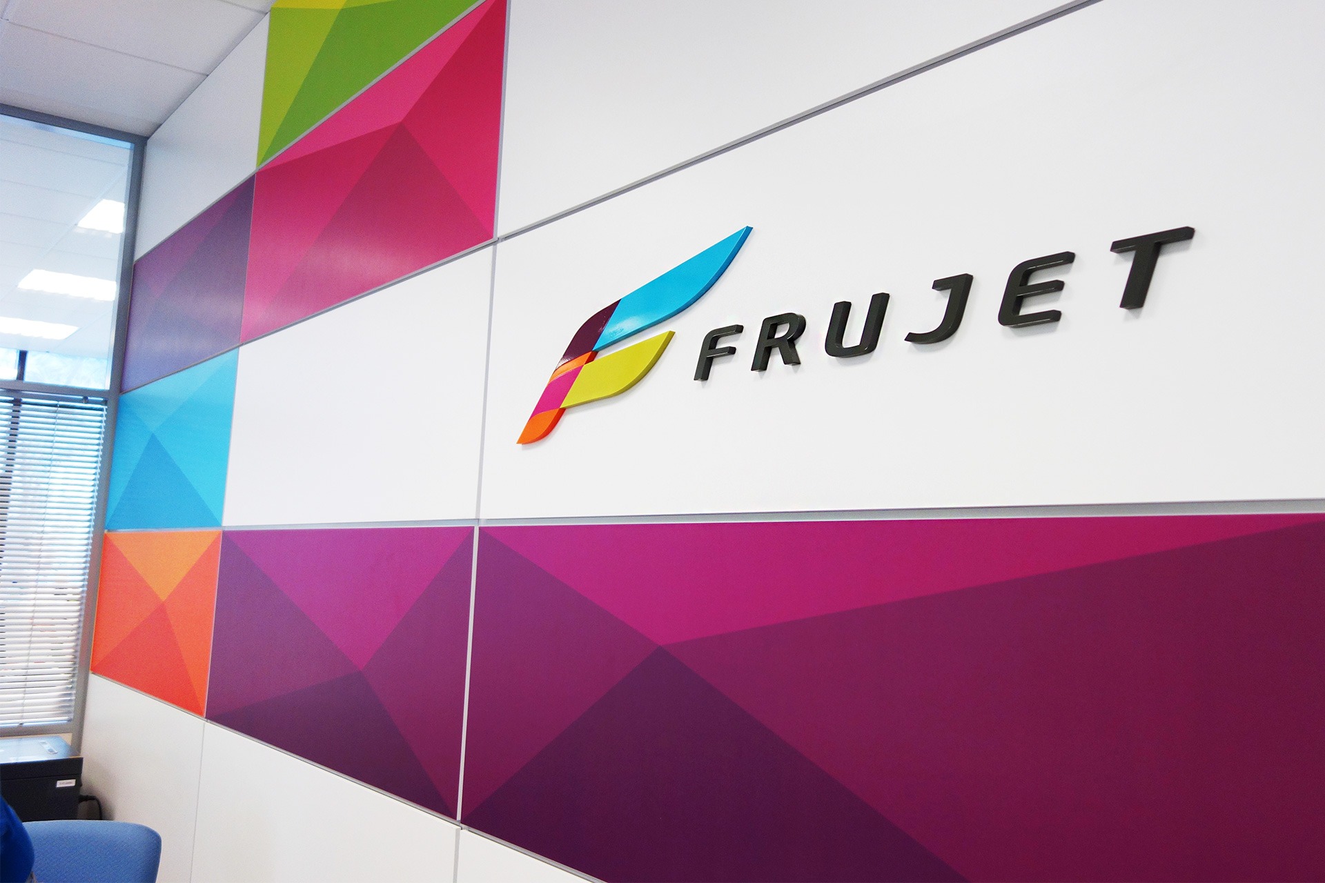
Graphic part of the logo – the letter F, stylized wing. Non-typical colors attracts attention and helps to separate from competitors in the industry.
Modern and positive image of the company was widely introduced for the first time at the World Food Moscow, where itraised many positive feedbacks.


Art Director / David Avakyan
Design / David Avakyan, Olga Loseva, Olga Vologzhaninova, Stanislav Virin
Project Manager / Irina Lavrenko
2013